This Surprised Me
I came across a new website this week, titled Economist Writing Every Day. It is full of interesting posts, and also led me to another good site about which I will write more down the road.
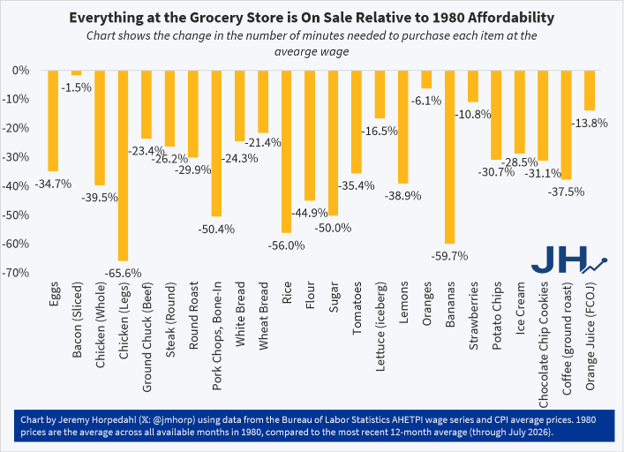
Below I paste in a figure from EWED whose content surprised me quite a bit. The increases in prices at the grocery store in both Canada and the US have been much in the news of late, and all the data says food inflation has been high in the last couple of years.
However, one can ask a longer term question: how expensive is food today compared to some time in the past? Say, 1980? I like that choice of year, as it is the year I started my new job as an assistant prof at UWO. (I’m sure that is not why the folks at EWED chose it.)
Not only have grocery item prices gone up since 1980, so have wages. So, how to do the comparison? One way to do this is to look at the change over that period in the ‘time price’ of various grocery store items. The time price of, say, bacon, is the amount of time a worker earning the average wage has to work to buy, say, a pound of bacon. The average wage went up since 1980, and so did the price of bacon. How has that turned out? Has the time price of bacon gone up or down?
The figure below, taken from a post on the EWED blog, answers that question for a list of grocery items in the US, and the surprising thing is that the time price of every item listed has dropped since 1980.
That surprised me, so I post it here for your information.
Of course there are only 24 items here, and there are many more than that which one might buy at the grocery store. The original author of the post points out that these 24 items are not cherry-picked. They are the 24 items that the US Bureau of Labor Statistics had data on for both 1980 and 2026.
[I also note that the biggest time-price drop in the US over this period was for chicken legs. I have been able to find no similar data for Canada, but I suspect that with our poultry marketing boards, this would not be the case here.]