Unexpected Cross-Border Grinchiness
I came across a short article in the Globe today which in turn sent me to a recent report by Canada’s Fraser Institute (it’s full of economists) that said this:
The percentage of tax-filers in Canada who gave something to charity declined from 21.9% in 2013 to 16.8% in 2023.
It also finds that:
The percentage of aggregate income given to charity in Canada has ranged between 0.52% and 0.55% over that same 10-year span.
So, giving as a percentage of income has been pretty stable, but it has been a decreasing percentage of filers who have donated, implying that those who still do donate are giving more than they did in the past.
Another surprising aspect of that first statistic is that the percentage who do donate has been declining very steadily over that period, with no blips up or down, not even during the pandemic year of 2020. (I cannot reproduce the graphs from the report here, but you can read it yourself here and check out their graphs for yourself). There has been a steady downward trend in the percentage of donors.
Now the writer of the Globe article suggests that one thing that is going on here is that some Canadians have switched their giving from charities to crowdfunding campaigns over time. The Fraser report says nothing about that, and I am very dubious about that explanation. Show me some numbers, man – do we know how much has been going to crowdfunding campaigns over time, and do they typically fund things that could be seen as substitutes for what charities do? I doubt it.
Well, not surprisingly, this made me curious about the trend in other places, so naturally I went to find numbers on the US. I will first say that Americans have forever given more to charities than Canadians by any measure. But it is the US that is the outlier here, the US is so far as I know the most philanthropic society on planet earth.
Still, one can wonder what is the trend in the US, and I did find some info. As you can see, the data for the chart below came from the Indiana University School of Philanthropy, an organization that was kind enough to fund a sabbatical I spent in Indianapolis a hundred or so years ago.
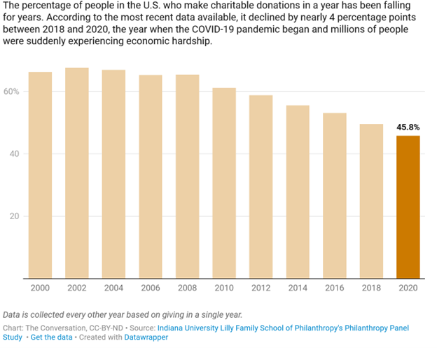
So, let’s consider carefully a comparison of this with the Canadian numbers. First, it is on a different time frame, starting in 2000, with the data being collected every two years only. Second, as I expected, the percentage who give to charity is waaaay higher than in Canada, but that fact needs to be treated with care. The Canadian numbers come directly from income tax records (anonymized, of course) and so are quite accurate. People who give get a deduction, you don’t want to fake donations you didn’t actually give on your tax form, and even if you give $10 you can declare it if you got a receipt.
Things are much different in the US tax system. To get any charitable deduction you must have enough total deductions to make it worthwhile to itemize them all. That is not true for most filers, so the percentage of tax filers who claim a charitable deduction would greatly understate the true percentage who donate. The numbers above – as noted under the graph – come from a survey the Center does. That is always dangerous to take literally, as if you ask people if they did something virtuous – like give to charity – they may say ‘yes’ even if they did not. So, the percentage of actual givers may be somewhat less than in that graph, but still – those percentages are waaaaay above the Canadian ones even if you discount them some.
That being said, note that the downward trend is the same, fewer Americans are donating to charity than in the past, also. hmmmm……
[One thing this suggests is that the title of the original Globe article ‘Canada has become a nation of charity grinches’ is perhaps unwarranted. Something international in scope is going on, perhaps.]
But wait – there’s more.
Below is a graph from the IU Center on the total value of giving to charity over the same period, adjusted for inflation.
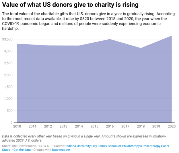
Now, this is not quite the same as the Canadian graph of giving as a percentage of total income, but it tells the same story. The total value of donations is up slightly, even though the number of donors is down, implying that those who still give are giving more.
Hmmmmm…… again.
There is an easy story to explain this. Easy doesn’t mean ‘correct’ of course, but here it is –
If people at the top of the income distribution are seeing most of the gains in total income over the last 10 or 20 years, then this would suggest that they might give more, while those at the bottom of the pile give less. Those at the bottom of the pile would have been giving less than those at the top anyway, so this overall trend results in fewer givers but a pretty steady total amount given.
Sorting that out in detail would require more data-analysis.