Yea, What Did Happen?
I do wander around the internet a fair bit, and from time to time come across something that is quite interesting. Sometimes those things prove rather less interesting on closer inspection, and I think that is the case for a site I am about to tell you more about. The site is called ‘WTF Happened in 1971?’ and it consists of nothing but many many graphs, all designed to convince you that the world changed in many fundamental ways in 1971. Actually, almost all of the data used to construct the graphs is from the US, so – the claim is really that the US changed in 1971.
You can go to the site here and have a look for yourself. If you do, here is the first graph you will see.

Now, if you did not know, ‘productivity’ refers to the value in dollars of output produced in an economy per something. The ‘something’ is typically hours worked, so productivity is really then just the total value of output (GDP, pretty much) divided by the total number of hours worked. However, sometimes it is expressed as the total value of output per full-time worker. The graph above does not specify which measure is being depicted. Compensation, on the other hand, is specified as hourly.
Note that both measures are expressed as an index. So, what was done to produce this graph is the following. Take whatever was the actual dollar-per-hour number for productivity in the US in 1948, and call that 0. Do the same for whatever was the average hourly compensation in 1948. Now, as time goes on, the number on the vertical axis is not the actual values of those things, but the percentage by which they have each increased since 1948.
And, given that, what the graph seems to indicate is that those two things increased in lockstep until 1971, at which point they were both 90% higher than in 1948. So, both productivity and hourly compensation had almost doubled in those 23 years.
Then, from 1971 on they diverge, with productivity in 2017 being 246% higher than in 1948, but hourly wages only 115% higher. Hourly payments to labour all but stagnated from 1971 on, it seems, even though labor was producing more and more dollars worth of output per hour worked (assuming the graph is depicting hourly productivity).
So, what happened? Well, one cannot say much from this. Another thing the graph does not tell us is whether the two measures depicted have been adjusted for inflation. After all, the value of output produced per worker will go up if the producers just raise their prices. That has nothing to do with an increase in productivity. Same for hourly wages and benefits. The graph does not tell us. I’m going to just assume the numbers are adjusted for inflation.
The site cites Economic Policy Institute for this data, and there are many organizations with that name. I know, I looked, but I could find this data at none of their websites. Ok, so I only looked for maybe 15 minutes, but here is a reason to wonder if anything really happened. I went to FRED, the US Federal Reserve system’s massive data source, and found the graph below;
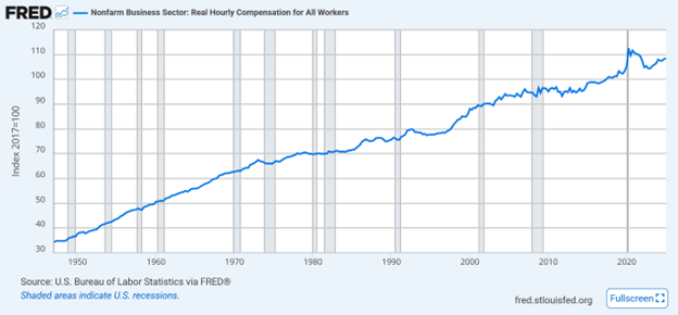
Source: https://fred.stlouisfed.org/series/COMPRNFB
I know, hard to read, but it depicts the real (meaning inflation-adjusted) average hourly compensation of all workers outside the agricultural sector, since 1948. It is in the form of an index, also, but if you check the fine details, the index has the value 35 in 1948, 64 in 1971 and then 100 in 2017 . So, the increase in the FRED index between 1948 and 1971 corresponds to that in the first graph above from the 1971 site. However, the increase in the FRED index between 1971 and 2017 results a value about 200% higher in 2017 than in 1948, not the 115% indicated in that first graph. Still less than the increase in productivity, but the gap is much less.
So, are the hourly wage numbers in that first graph bullshit? Maybe, as there is a fair bit of bullshit on the site, as I will detail below, but there is also a possible legitimate explanation. The FRED graph refers to hourly compensation for all workers while the WTF1971 graph refers to production and non-supervisory workers only. So, it is possible that the difference in the increase in compensation on those two graphs corresponds to the fact that ‘supervisory workers’ have seen their hourly compensation rising at a faster rate than production workers. I think that’s plausible, but will leave it to the interested reader to investigate further. If that is true, then of course it just leads to a different question: why did that happen after 1971?
The point is that this first graph on the site is clearly designed to make you wonder ‘why have workers been getting screwed since 1971?’ A careful look possibly leads to a different question: why have supervisory workers compensation been rising faster than that of production workers? (If that is indeed the case…) As always, life is more complex than can be captured in one under-explained graphic.
Here are some things from elsewhere on the WTF1971 site that make me doubtful about how carefully it has been put together.
One of the graphs you will find on that site claims to depict ‘interest rates since 3000BC’, supposedly put together by the Bank of England. I don’t care if the BoE did put that data together, pretending that it is in any way reliable going back to 3000BC is hogwash. Might be fun to try and put such a data set together, digging through references in the bible and other ancient sources, but please let us not pretend this is reliable data, or that it can be used to claim that something big happened in 1971.
Similarly, another graph claims to depict the CPI (Consumer Price Index) for the US since 1776. Yea, ok. There is a reference to Reinhart and Rogoff (2009) for this graph, and that might (I cannot tell) refer to a rather famous and controversial book those two economists wrote about national debt crises. However, it does not matter. The graph on the site has inflation trucking along with nothing dramatic happening until WWII, and then, it rises very dramatically – you guessed it, from 1971 on. The problem is that if your zero point in any index is entirely unreliable, like price information for 1776, nothing that happens later with the index is informative.
Another careless caption on the site is this, below a graph of ‘energy consumption’. The caption is:
Energy consumption per-capita in the US. One kilowatt, of course, equals 8,766 kilowatt-hours per year.
That second sentence makes no sense at all, but after peering at the associated graph for awhile, and doing some arithmetic, I am pretty sure that what was intended was ‘One kilowatt-year-per-capita equals 8,766 kilowatt-hours-per-capita’.
That at least adds up, but being clear and careful is not what this site is about. I figured out why, when I got to the bottom, and clicked on ‘Get WTF1971 merch’
They’re selling shit. You can order a T-shirt with 197! embossed on the front, or a mug with WTF 1971?.
The internet is all about selling shit, this we know, not about being clear or careful.
That all being said, here are a few more graphs from the site that I have reason to think might be telling us something, only because I think they correspond to what I have learned from other sources.
For example:

The Federal Register is where almost everything that the US Federal government does gets published, so the number of pages in it is a sort of indicator of how big and complex is that government. From the .gov website:
“Published by the Office of the Federal Register, National Archives and Records Administration (NARA), the Federal Register is the official daily publication for rules, proposed rules, and notices of Federal agencies and organizations, as well as executive orders and other presidential documents.”
The Register has only existed since 1936, and the graph depicts how it has grown since then. Of course the red arrow points at the fact that it really started to grow in the 70s, but there are other things worth noting about that graph. One, it takes a noticeable dip between 1980 and 1988, which corresponds to the Regan presidency. Maybe he really did make the federal government smaller and less complex? Also, there seems to have been another big drop in the late 2010s, and I would like to know what that was all about. Trump I? That seems doubtful, but I don’t know.
Another interesting graph depicted the share of foreign-born individuals in the US population over time, along with their absolute numbers. No source was given for that graph, so I was dubious. I went and found a graph I think is from a reliable source, which I reproduce below, and I will admit that the one on the 1971 site is pretty much comparable.

What I found surprising and interesting is that both the absolute number and population share of foreign born in the US bottomed out in the 70s (yea, there it is again) after peaking in the 20s and 30s and have been increasing since. The absolute numbers dwarf those from what I always thought of as the big immigration periods of the late 19th and early 20th century, and the percentage has just recently again attained those levels.
I got more curious, so went looking for info on other countries. It turns out that currently, Canada has the 7th highest percentage of foreign-born residents of all countries, at 23%, with the largest single group being Indian. The UK ranks 10th in the world with 14%, the largest group again being Indian, while the US ranks 11th with the largest group being Mexican. The country with the largest foreign-born population turns out to be the UAE at 88% (really), and the largest group being – you got it – Indian. The top 6 countries ahead of Canada are all in the Middle East, and the largest group in all of them is Indian, except for Lebanon, which has the same 23% proportion of foreign-born as Canada, but the largest group there is Syrian. I think we can all guess why that is true.
If I can find historical data on immigration for Canada (hard to do, in my experience) and other countries, there might be some interesting comparisons to be looked at. Stay tuned.
Here’s a notable graph designed to scare you (well, they all are, kinda) for which the site creators don’t seem to have noticed 1971 is not really special.

Keep in mind that ‘debt’ refers to the total amount owed by the US govt, here expressed as a percentage of the contemporaneous GDP. So, it’s the total value of US govt bonds outstanding in a year divided by that year’s GDP. Do ignore that big run-up after 2024. That’s called a guess, and the site provides no info on where the part after 2030 comes from. If anyone knows what is going to happen to anything over the next 25 years, why ain’t they rich? Anyway, nothing special happened in 1971 that I can see. Bonds outstanding relative to GDP declines a lot after WWII, largely because that was the period when US GDP grew like gangbusters. It hits a trough in the mid-70s, then heads back up into the 90s, when it drops again for a while (Clinton actually ran a budget surplus for at least one year) until it really starts climbing early in the 21st century. The WWII era remains the undisputed champ, and no one knows…..as in no one knows….what will happen going forward. DJT’s big beautiful bill combined with his big beautiful tariffs certainly seems like a one-two-punch designed to send that red graph climbing again. However, as all good philosophers know – Shit Happens.
As I said at the outset, this site seemed very interesting when I first came across it. A closer look, as with so much on the internet, showed it to be just another way to sell shit. Not wholly uninteresting, but the devil is always in the details, and the 21st century is not, in general, much interested in details. [See; DJT, K. Harris, J. Trudeau, X, TikTok, etc….]
Marg
Thanks. They say “a picture is worth a thousand words” but one does have to be careful about the associated words. Appreciate your regular reminder to think critically.