You Call This Journalism?
Regular readers know that I am in general despair regarding the state of 21st century journalism. My local paper, to which I still subscribe as a matter of duty, has almost no staff, no resources, and the people employed there cannot even write English.
Here’s a recent LFP headline – yes, from the bloody front page:
Another Winter Weeather Wallop
Either they have no copy editors any more, or no one there knows how to spell ‘weather’.
The Globe and Mail, which is really a Toronto paper that tries to sell itself as the Canadian paper of record, gets worse almost by the week, but again I pay for a (online only) subscription as a way to stay informed about happenings in Canada. There is much that they ignore, so I also subscribe to The Free Press, which features a This Week in Canada post by one of its writers.
Then there is the Wall Street Journal, easily the most expensive of my many subscriptions, which I rely on for US and World news. It, sadly, is also becoming more and more staffed by badly trained, semi-literate and barely-numerate staffers. On top of that, they don’t seem to have any editors either, as the example below will indicate.
The top right hand of today’s WSJ lists a set of ‘Opinion’ columns, and the first one on the list is credited to The Editorial Board, titled The Affordability Problem in One Chart.
The sub-headline under that title says ‘Wages aren’t rising fast enough to counter still-rising prices’.
Ok, so we know the point of the story. Below is that ‘One Chart’ from the article that is supposed to convey this simple message.
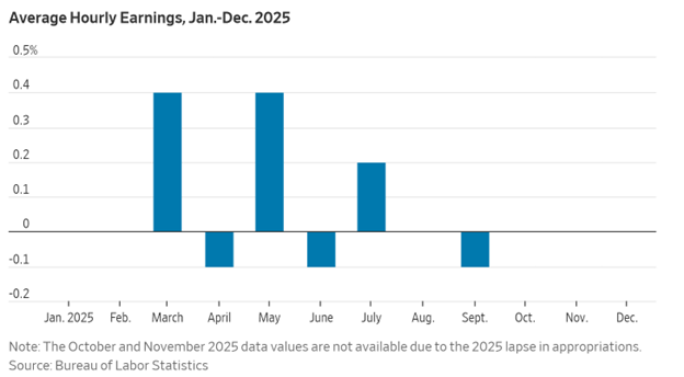
So, let’s have a close look at it.
Along the horizontal axis we have the 12 months of 2025. Fine. Easy.
On the vertical axis the graph is labelled ‘average hourly earnings, Jan-Dec. 2025’
Um, guys…..earnings are measured in dollars, the numbers on the vertical axis are percentages. So, that is not what is on the vertical axis.
It must be in fact ‘the percentage change in hourly earnings’…right?
Ok, but wait a minute. A percentage change can only be measured as a percentage change from something. So, is this the percentage change from one year previously, the way the inflation rate is typically expressed, or is it the percentage change each month from the previous month?
Don’t know, but since we have been left to figure this out on our own, let’s just take a leap and assume it is the percentage change from the previous month.
The ‘Note’ below the charts says that Oct and Nov data are not available due to the lapse in appropriations. Ok, but…..why is the Jan, Feb, Aug and Dec data also not available? Dunno. Doesn’t say.
And, if we are right in guessing that those lovely blue bars represent the change in earnings from the previous month, then that missing data means that this ‘one chart’ tells us exactly nothing about what has happened to earnings over the last year. If the missing blue bar from Aug were, say, -2.4% then over the year earnings would have decreased terribly, but if it were, instead, +3.1% then whoo-hoo, things are going great. And of course that is only one of six missing months on that graph. Indeed, depending on what those missing six (half) data points are, anything might be true of the change in earnings over 2025.
And, and….it is almost embarrassing to go on like this….there is nothing in that graph about how much prices were ‘still rising’ in that same period. Nothing.
So, esteemed WSJ Editorial Board, your one mis-labelled graph with half of its undefined data missing tells us exactly zero about ‘The Affordability Crisis’. All it tells me is that the WSJ Editorial Board should all be fired. Ah, but then who would replace them?
Journalism was bad enough when people thought they could learn to be journalists by going to schools of journalism, rather than taking courses in English composition, History, Economics and Math. Now at my old employer they take courses in The Faculty of Information and Media Studies.
We all by now know the quality of education one gets from anything with ‘studies’ as the last word.
The Information Age, my ass.