Whither Goest The Middle Class?
One can write only so much about a 34-year-old with zero experience, even if they are a mayor-elect, so let’s turn to something a bit more hard-nosed, some income statistics. The graph below is from the blog Marginal Revolution, written by economist Alex Tabarrok, but credit where due, I first came across it in an article from The Free Press.
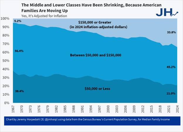
Now, let’s be clear about what this shows. It is based on data from the US Census Bureau’s CPS, which has been about as reliable as large data sets get for a very long time. It shows the change in the proportion of families in the US that are in three different annual income ranges: below $50k, above $150k and in between those two annual incomes. Thus, note that all families have to be in one of these three ranges.
The key point here is that the percentage of families in the bottom two groups have decreased between 1967 and 2024, while the percentage in the top group has increased. Very importantly, this is all measured in constant 2024 dollars, so this is not the result of inflation, which has of course been considerable over that period.
Thus, we have the caption – American families have been moving up.
There are other questions to ask about this surprising (to me) graph, however. For example, since this is household (i.e., ‘family’) income, is all this just a reflection of the fact that more and more households have come to have two earners in them over this time frame?
Well, Tabarrok considers this, and his answer is ‘yes, but only partly’. He provides a link to another economist’s blog, where you can find the graph below:
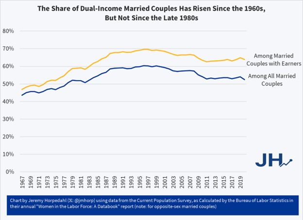
What this shows is that the percentage of married couples with two income earners did rise from 1967 to the late 90s, but after that it actually dropped a bit. So, the increase in household income shown in the first graph can reasonably be the result of more two-earner households up to the 90s, but after that it is simply because earners, whether one or two, are earning more in real terms.
So, the bottom line seems to be, for the US, if the middle class is truly disappearing (meaning those families in the middle income group), it is because they are moving into the higher income group. And, of course, the lower income group is shrinking in proportion too, as those folks earn more.
This is a surprise to me, but I suppose only because we all read so often in the media how everyone is suffering these days. Also, I wonder very much whether anything like this is true in Canada. As always, data of this quality is much harder to find for Canada, but I will keep looking and report back if I find anything. For now, let’s just say that reports of the relative impoverishment of families in the US middle class seem to have been rather exaggerated….unless I am missing something here.
Before closing this off, I will mention one more thing. Below is another graphic covering almost the exact time period as those above. It comes from the US Fed, and it depicts the Gini coefficient for income in the US over this period. The Gini is a long-used index of how unequally is income distributed in any population. A higher Gini index indicates a more unequal distribution. This graph is a bit odd in that the Gini is typically given as a decimal number between 0 and 1, and here it is a whole number. If you just put a decimal point in front of the numbers on the vertical axis you get the usual thing.
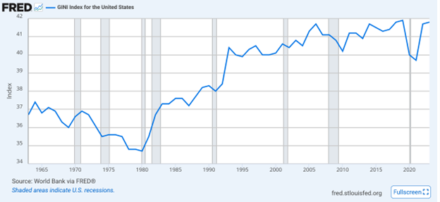
So, it is clear that income is distributed more unequally today in the US than it was in the 60s, and that the big increase in this measure occurred between 1980 and 2005. Since then it has bounced around. However, note that the actual change has not been a lot over that period – it went from 0.36 to almost 0.42. Secondly, given what we saw in the first graphic, one could ask whether this trend is even worrying. That is, if almost everyone is seeing their income increase in real terms, does it matter that income is distributed somewhat more unequally? What I suspect is going on here is that for the group with incomes above $150k, incomes have been growing more than for those in the two lower income groups. That would increase the Gini as we have seen, but still be consistent with more families moving into that group.
A final point, about which I have little to say, so far. The first graph above is about gross incomes, that is, before tax, and I think the Gini numbers are, also. Now, the US is a low tax country by any standard. The Tax Policy Centre notes that “In 2021, taxes at all levels of US government represented 27 percent of gross domestic product (GDP), compared with a weighted average of 34 percent for the other 37 member countries of the Organisation for Economic Co-operation and Development (OECD).”
However, it may be that over the period covered in the graphs above, that tax percentage went up, in which case the disposable incomes of US households may not have increased as much as did their gross incomes. This is harder to track, but I did find data from the same Tax Policy Centre indicating that US federal income tax rates have not changed much since the 1980s, and that the rate paid by those in the lowest income quntile has actually dropped noticeably. This of course only considers federal income taxes, not taxes levied by other levels of government or sales and other commodity taxes.