Gonna Get Geeky – and Long
Hey, let’s not think about the recent US election for a bit, ok? I want to write about something much more exciting – economics!! Even better – debt!!
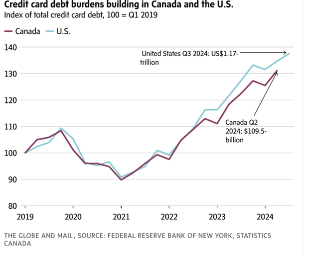
Writing about government debt immediately tends to get pretty political, so I’m going to write about something less political, I hope – consumer credit card debt. This was prompted by a brief story in the Globe on Saturday that led off with the graph below. It shows what has happened to credit card balances in both the US and Canada since 2019, indicating that they are 30%+ higher this year than they were in 2019.

I will note, as a minor aside, that the good ol’ rule of 10 holds here, once again. That is, that since the US has about 10 times Canada’s population, most national statistics in the US are 10 times bigger than in Canada. Here, it holds for the actual amount of recent credit card debt: $1.17trillion in the US to $109.5billion in Canada (I’m assuming here the Canadian number has been translated into US dollars, otherwise the Rule of 10 is rather in doubt.)
The US numbers come from a recent report by the New York Fed , and you can read the entire report here – https://www.newyorkfed.org/microeconomics/hhdc
It’s a vast and fascinating (if you’re a geek) cornucopia of charts and graphs, which is useful, because the commentary by readers attached to the Globe article raises a number of questions that do seem important. The theme of the article itself is that the chart above indicates that the US economy, or more accurately, the typical US consumer, whoever that is, is not in such great shape. However, various commenters point out that this one statistic doesn’t tell us much about that, we need to know some other numbers, like how consumer debt compares to consumer income over time, as well as what proportion of these credit card balances are earning interest. That is, is most of this representing balances that are paid off each month, or are they balances that are being carried month to month and thus drawing interest at over 20% per year? Also, are the charges that make up these balances payments for basics like groceries and utilities, or are they for ‘discretionary’ expenditures?
Even more critically, how much of this debt is in delinquency, representing cc balances on which required payments are not being made?
First, a chart on p.3 of the Fed report (which is actually several pages into the report itself) consists of a chart that shows the proportion of total consumer debt in the US of all forms, and this makes it clear that cc debt is pretty tiny. The single biggest source of consumer debt is in mortgages, which made up 70% of consumer debt in 2024Q3. This was followed by student loans and auto loans, each making up only 9% of the total, and cc debt being only 6%. (A later graph shows that there are many more cc accounts than mortgages, some 600million versus only 80million mortgages, but of course the mortgages are for much larger amounts. That 600million number also tells us that most folks have more than one credit card, btw.)
Now, one might say that cc debt is what moves around the quickest in response to changing economic conditions, and so is still important as the proverbial canary in the coal mine, even if it is a small part of overall debt. Fair enough, so what is going on over time with cc debt in the US?
One interesting stat, make of it what you will, is that while cc balances in 2024 in the US were indeed just over a trillion dollars, credit card limits were over 5 trillion dollars, so on average, people carry balances that are only 20% of their credit limit. In addition, the same chart shows that credit limits have increased much more than credit card balances over the last two or three years. Both those things seem like an indication that not many consumers are running up balances to their limits, but of course they could also simply indicate that issuers are very willing to increase credit card limits when asked.
What would seem a very clear indicator of consumer distress is the percentage of cc accounts that are delinquent, with payments being 30, 60, or up to 120+ days late. The Fed report tracks this, too, and it shows (p. 11) that overall delinquencies of all lengths hit a high of 12% of accounts in 2010, right after the financial crisis. No surprise there. Since then, the delinquency rates have all trended down nicely, hitting a low of around 3% sometime last year. The percentages have been ticking upward slightly since then, hitting a total of just under 4% being in some level of delinquency in Q3 of 2024. Not a good recent trend, but maybe not yet alarming.
Looking across categories of debt, a graph on p. 12 shows that the rate of loans being 90+ days delinquent has continued to trend downward for mortgages, revolving debt, and student loans. That last has crashed since 2021, no doubt due to Joltin’ Joe Biden’s ongoing attempts to forgive many student loans. Only auto loans and credit cards have seen a recent uptick in their delinquency rates.
Some final general stats to finish up the US story. Foreclosures and bankruptcies hit long-time lows in about 2022, and have been ticking up very very slowly since then (p. 17), and although the percent of cc accounts in third party collection (a very bad place to be) has declined a lot since 2016, and continues to do so, the amount in collection per account in collection has jumped up precipitously. So fewer cc accounts are in collection, but the amount those accounts are in arears appears to have increased by some 40% since late in 2022. I don’t honestly know what to attribute that to.
Now, it would be useful to compare all this to what is happening in Canada, and as usual comparable stats are much harder to find here. Say what you will about the US, they devote a lot more resources to producing useful stats about themselves than do we. Almost the only org in Canada that does that sort of thing is StatsCan. What follows is some useful, if not directly comparable data from that source.
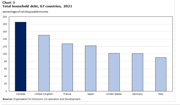
First, and I admit this surprised me, Canada has the highest ratio of consumer debt to disposable income among the rich G7 countries, as shown below:

Just as surprising to me is that Italy has the lowest ratio. Hmmm…..
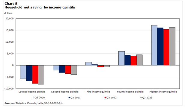
Some of the commenters on the original G&M article point out, quite correctly, that the numbers on that first chart are national averages, and so say nothing about the possibility that some segments of the population might be in particular trouble on the debt front. This is of course likely to be those at the bottom of the income distribution, and that very sensible point can be made about every US statistic I quote above. Below is a disaggregated stat that speaks directly to that issue for Canada, again from StatsCan.

Even in 2020, when the folks at the bottom of the income distribution were getting reasonably big pandemic transfers from the Canadian government, they were on average spending more than they earned. (To be honest, I cannot tell if this table’s figures include those government transfers as part of income. I’ve tried….) Moreover, the trend has been negative for those in the bottom three income quintiles since the pandemic. That is, their net saving has decreased – become even more negative – from 2020 to 2023. Only for the top two income quintiles has net saving been positive throughout this period, although it has fallen slightly since 2020 even for the fourth and fifth quintiles.
That says that overall, the folks in the bottom three quintiles have been borrowing (or drawing down any savings they had) more, and those in the top quintiles have been saving less. That doesn’t say ‘healthy consumers’ however you slice it.
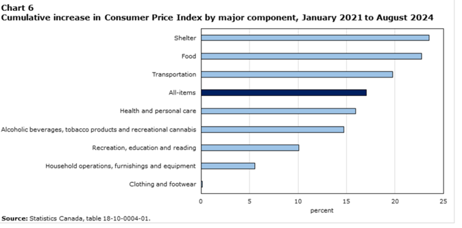
A final Canadian graphic from StatsCan which says a lot, I think:

Note that this is a graph of the cumulative increase in prices of goods and services in selected components of the CPI from ’21 to ‘24. What it shows is that the three components in which prices went up the most in that three-year-plus period were shelter, food and transportation, three things that everybody spends on. However, it is beyond doubt that those at the bottom of the income distribution spend a greater proportion of their disposable incomes on these three things than do those at the top.
Nothing healthy about that, either, particularly for those at the bottom. If one really (still) wonders at the reason for the unpopularity of the federal Liberals and their glorious leader these days, maybe the key is right there.