Oh For Crap’s Sake, G&M
I was at a gathering of mostly family (not my family, I was a guest) over the weekend at which someone said to me ‘I blame the media for much of what is wrong with the world today’.
An extreme statement, but one with which I find it hard to disagree. It is bad enough that little contemporary journalism provides us with facts, but what is really infuriating to me is that absolutely misleading horseshit shows up so often in mainstream (as well as much not-mainstream) media.
I offer you exhibit A, a Globe and Mail article titled ‘Are Canadians getting their money’s worth from their health system?’ authored by one Frederick Vettese, and marked as both ‘Opinion’ and ‘Special to the Globe and Mail’.
Special, indeed. The piece is centred on the graphic below –
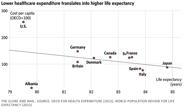
I hardly know where to begin, but let me start by saying that many of the comments that were submitted on this article by Globe readers exhibit a lot more wisdom about the topic than that shown by the author.
Let’s start with something mildly technical: what data on what countries was used to draw that downward-sloping line? If it was just the 11 countries actually labeled in the graph, then this is cherry-picking data of the highest order. As a commenter pointed out, if that is the case, and you take the US out of the data, the line almost certainly slopes upward. On the other hand, if you leave the US in and take out Albania, it will have a much more negative slope.
The author does not think it important to say anything much about just what data is in there.
Let us give him the benefit of the doubt, and assume the line was drawn using data from every country on planet earth. This brings us to the caption on the diagram.
‘Translates into’??
What is that supposed to mean? Many of the commenters (as well as myself) took the caption to be suggesting that higher health care expenditure causes lower life expectancy. But god forbid a journalist use clear language. That one cannot infer such causality from this diagram, whatever data was actually used to draw it, is again clear to most of the commenters, and I hope to you, gentle reader. One very basic and relevant reason is that both health care expenditures and life expectancy are surely driven by other factors. Imagine a country in which disease rates are high, for any reason. This is going to decrease life expectancy as well as induce higher health care spending by both governments and individuals. Bingo, downward-sloping curve.
As they say – duh.
Also, I doubt anyone with a lick of sense thinks that increasing life expectancy is the only goal of health care. However, if one wanted to actually begin to understand what influences life expectancy, there are about a million other things that one ought to include in any statistical assessment, starting with per capita income, moving on to incidence of chronic disease, urbanization (hello, Albania), educational attainment, poverty rates….I could go on.
Thus, the author’s sentences:
“It is reasonable to expect that spending more on health care should lead to better overall health and hence longer life expectancy. If this is true, the trend line in the chart should be a straight line sloping upward from left to right.”
are baloney. Or, bologna. There is no reason to think it should be upward-sloping when all those other things are ignored.
The author also writes
“More spending certainly seems to be counterproductive. But more likely, the additional spending is not being put to good use.”
So, he truly does appear to be clueless. No, your graph does not ‘certainly’ imply that more spending is counterproductive, Mr. Vettese, nor does it provide any evidence about how well health care spending is being used in Canada or anywhere else. The efficacy of money spent in health care is a devilishly hard to measure thing, and your simple-minded graph tells us nothing about it. Nothing.
Indeed, nothing in this sad little article tells us anything about the answer to the question in its own headline.
Another F- in informativeness for the Globe and Mail.